What is a Brand Identity?
The word ‘brand’ gets thrown around all the time when it comes to creating a business - but what does it actually mean?
It’s this umbrella word that always seems to be pigeonholed to just a logo and company name when in reality, it’s so much more than those two things. A brand should always start with its strategy, figuring out and developing its mission, vision, position, tone of voice, target audience, etc. and you can read a little about this here!
Once you’ve developed your strategy you are ready to develop your brand identity. In this blog post, we’ll be briefly explaining what your brand identity really is and why it matters. As a starting point we’ll be exploring 6 steps that make up a brand identity.
Logo
Colour palette
Fonts
Form/Shape
Imagery
Additional Elements
Let’s dive a little deeper into what these points actually mean:
Logo:
Although your logo is not your brand, it is an important part of it. The technical definition is a symbol made up of text and images that identifies a business. A good logo shows what a company does, and what the brand values. Essentially, your logo is the foundation of your brand. It needs to be unique, easily recognizable and must give your potential customers an idea of what you offer. “A logoless company is a faceless man” - David Airey
Colour Palette:
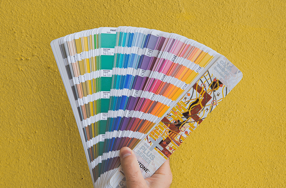
Colour actually increases brand recognition up to 80% and is an easy way to make your brand more recognizable! Your colours also play a large role in how your brand’s personality is perceived. For example, if you use a lot of yellow, it evokes feelings of happiness, youth, optimism or affordability.
Fonts:
Fonts in particular leave either a good or bad impression in the mind of your customer. Your brand’s font’s literally speak to your customers, make sure it says the right thing. Some simple examples might be if you want your brand to be traditional and formal, you will want to stay away from handwritten fonts and want to go with a serif font, or if your brand is looking to attract a younger, tech savvy clientele your brand will want to go with a sans-serif font.
Form/Shape:
I know you might be scratching your head with this subtitle. “Form? Shape? My brand isn’t a clay sculpture.” Well, you’re right but the designers at Sunday Roast look at Form and Shape a little differently. The overall form and shape of your logo and brand elements is a subtle but effective way to send subliminal messaging to your clientele. Form and shape refers to the overall shape of your logo. Is your logo icon a circle or is it a square? A logo that is all circles and soft edges will inspire a very different reaction from a logo that features sharp corners. It’s all about how you want your clientele to view your brand.
Imagery:
Brand imagery is an opportunity to visually communicate with your potential customer. It is another way to ingrain your brand into your customer’s mind. These images are more than simple visuals—they convey an emotion in the viewer, something they can associate with your brand. A picture is worth a thousand words.
Additional Elements:
Additional brand elements could consist of a set of icons, textures, patterns, watermarks, or even utilizing the logo itself (or a variation of it) to create depth and interest to the aesthetic of the brand as a whole. These elements should connect with the look and style of the logo in some form, use the colour palette developed and if they are typographic, match the fonts you have chosen for your brand.
So you can see, creating a brand identity is more than just a logo. It is building every touch point with your audience to have a consistent visual aesthetic, and the clearer that aesthetic is, the more consistent and impactful your advertising, digital profiles, website, physical store/office and all print materials will be.
Need help with developing your brand identity?